I was deep into the weeds trying to crack my onboarding dilemma. For a few weeks now, I’ve been trying to figure out why people are signing up for the Bwak News app, but not onboarding any newsletters.
And then something caught my attention. The green highlight text I chose for the site was difficult to read.
I have good color perception. In fact, Charlotte has crowned me the official paint color picker when it comes to decorating our house. So, I figured if the text was difficult for me to read, the roughly 8% of men with red-green color vision deficiency would struggle to read it also.
That wasn’t ok with me.
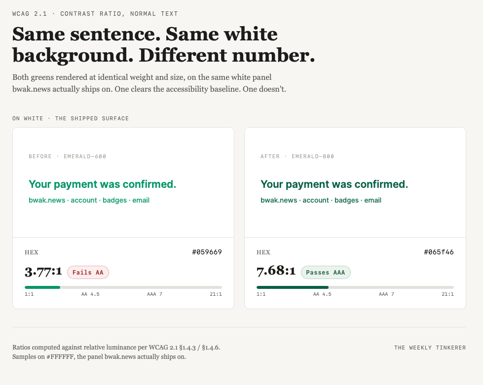
I was aware of the accessibility guidelines published by the Web Content Accessibility Guidelines (WCAG), but never had to worry about building with them. So I was surprised when I handed the problem off to my AI agent, and it threw up a sample page showing that indeed, the emerald-600 (hex #059669) green color I selected for the website failed the standard.
Standard? What standard? Up until now, my choice of colors was always based on taste and if it reads fine, ship it. I had no idea that the standard specified a way to calculate the contrast and grade it as a means to quantify accessibility usage of your application.
Every color has a computable relative luminance, which is a fancier and more accurate way of saying “how bright it actually reads to the eye.” Take two colors, compare their luminance, and you get a contrast ratio. Identical colors give you 1:1, invisible against themselves. Pure black on pure white gives you 21:1, the ceiling. Everything else falls somewhere in between, and the formula gives the same answer every time, for every viewer, regardless of taste.
My green, emerald-600, measured 3.77:1 against white. WCAG’s baseline standard for normal text is AA, and AA requires 4.5:1. My “fine, it’s just a light green” accent color was failing the accessibility standard I didn’t know existed.
There are two levels worth knowing; AA is the baseline most sites are expected to hit: 4.5:1 for normal text, 3:1 for large text (think 18-point-plus, or bold at 14-point-plus). AAA is the stricter tier, not usually a legal requirement but the one that gives you real margin instead of a bare pass: 7:1 for normal text, 4.5:1 for large. My original green wasn’t even clearing the low bar.
I went with the recommended emerald-800 (hex #065f46), a 7.68:1 ratio. Not a bare pass over the AA line, but clear of AAA too, with real margin to spare.
Because the color lived in one config token instead of being copy-pasted into forty places, changing it fixed the accent color across the entire app in one shot: CSS, every transactional email, account and billing pages, badges. All of it, except three admin-only internal tools I left alone on purpose, because nobody outside my team ever sees those.
The part I want to hand you isn’t the story. It’s that this is checkable, right now, on whatever you’re running, without asking anyone’s opinion:
1. Chrome DevTools — inspect any text, click the color swatch next to color in the styles panel, and it shows you the live ratio plus AA/AAA pass or fail, along with a suggested color that would pass. Fastest option, already installed.
2. WebAIM Contrast Checker (webaim.org/resources/contrastchecker) — paste in two hex codes, get the ratio and pass/fail for both normal and large text. It’s the tool most accessibility writeups point to first.
3. Lighthouse (also built into Chrome DevTools) — audits a whole page at once instead of one pair of colors at a time, so it’ll surface every low-contrast spot you didn’t think to check.
4. An AI coding assistant — ask it to build you a side-by-side comparison tool for your candidate colors, with real computed ratios. It’s not a shortcut around the standard; it’s a fast way to see the standard applied to your actual palette, which is exactly what got me here.
You already have a website, an app, a newsletter template, something with text on a background. Open DevTools, click your accent color, and read the number. If it says fail, you now know something concrete instead of something you assumed.